Labels

303 GALLERY AGE OF AQUARIUS AI WEIWEI ALDO MONDINO ALIGHIERO BOETTI ALLORA & CALZADILLA AMSTERDAM ANDREAS GURSKY ANDREAS SCHON ANDY CROSS ANDY WARHOL ANISH KAPOOR ANNE IMHOF ANSELM KIEFER ANTON CORBIJN ARNDT ARNOLFINI ART PROSPECT ARTISSIMA ARTIST BOOK ATTILA CSORGO BALI BARBARA KRUGER BARCELONA BASEL BASQUIAT BEATRIX RUF BELA KOLAROVA BENJAMIN DEGEN BEPI GHIOTTI BERLIN BERND E HILLA BECHER BETTY WOODMAN BIENNALE BORIS MIKHAILOV BRISTOL BROOKLYN MUSEUM CAI GUO-QIANG CAMILLE HENROT'S CANDIDA HOFER CARDI GALLERY CARL ANDRE CAROL RAMA CAROLEE SCHNEEMANN CARSTEN HOLLER CASTELLO DI RIVARA CASTELLO DI RIVOLI CATHERINE AHEARN CENTRE POMPIDOU CHARLES RAY CHARLINE VON HEYL CHICAGO CHRIS BURDEN CHRIS WATSON CHRISTIAN BOLTANSKI CHRISTIE'S CHTO DELAT COLOGNE CONCEPTUALISM COPENHAGEN COSMIC CONNECTIONS CRISTIAN BOLTANSKY CY TWOMBLY DAMIEN HIRST DAN GRAHAM DANH VO DANIEL EDLEN DANIEL RICH DANNY MC DONALD DAVID ZWIRNER DIA ART FOUNDATION DIET WIEGMAN DIETER ROTH DOCUMENTA DUBAI DUSSELDORF ED ATKINS EDEN EDEN ELGER ESSER EMILIO ISGRO' ESKER FOUNDATION ETTORE SPALLETTI EVA HESSE EVA PRESENHUBER FANG LIJUN FAUSTO MELOTTI FELIX GONZALES-TORRES FILIPPO SCIASCIA FONDATION BEYELER FONDATION CARTIER FONDAZIONE MERZ FRANCESCO BONAMI FRANCESCO POLI FRANCESCO VEZZOLI FRANCIS BACON FRANKFURT FRANZ KLINE FRIEDMAN GABRIEL OROZCO GABRIEL YARED GAM GARY ROUGH GEORGE BURGES MILLER GEORGE HENRY LONGLY GERHARD RICHTER GILBERT & GEORGE GIULIO PAOLINI GLADSTONE GALLERY GREENE NAFTALI GUENZANI GUGGENHEIM GUGGENHEIM BERLIN GUGGENHEIM BILBAO GUILLAUME LEBLON HAMBURG HAMBURGER BAHNHOF HAMISH FULTON HANGAR BICOCCA HAUSDERKUNST HAUSER & WIRTH HE XIANGYU HELENA ALMEIDA HEMA UPADHYAY HENRY MOORE HIROSHI SUGIMOTO HOWIE TSUI HUANG YONG PING IAN BREAKWELL ICA ICHWAN NOOR INSTALLATION INTERVIEW ISABELLA BORTOLOZZI ISTAMBUL JAMES LAVADOUR'S ROSE JAMES MELINAT JAMIE XX JANET CARDIFF JANNIS KOUNELLIS JASSIE BOSWELL JEFF KOONS JEPPE HEIN JESSICA WARBOYS JIVYA SOMA MASHE JOAN FONTCUBERTA JOHN BALDESSARRI JOHN MCCRACKEN JOHN STEZAKER JON RAFMAN JORG SASSE JOSEPH KOSUTH JOTA CASTRO JURGEN TELLER KARA TANAKA KARL ANDERSSON KARLSRUHE KAVIN APPEL KONRAD LUEG KUNSTHAUS KUNSTMUSEUM LARRY BELL LIA RUMMA LISSON GALLERY LIU YE LONDON LOUISE BOURGEOIS LUC TUYMANS LUCIAN FREUD LUCIE STAHL LUIGI MAINOLFI LUISA RABBIA MADRE MAM PARIS MARC QUINN MARCO CASSANI MARIA CRISTINA MUNDICI MARIAN GOODMAN MARINA ABRAMOVIC MARIO MERZ MARK LECKEY MARK ROTHKO MARTIN KIPPENBERGER MARTIN McGEOWN MARZIA MIGLIORA MASSIMO DE CARLO MATTHEW BARNEY MAURIZIO CATTELAN MAX SCHAFFER MAXXI MIAMI MIKE PARR MILAN MIMMO ROTELLA MING WONG MOMA MONTREAL MOUSSE MUMBAI MUYBRIDGE NATIONAL GALLERY NEW YORK NICO MUHLY NOBUYOSHI ARAKI NOTTINGHAM CONTEMPORARY NY OFCA INTERNATIONAL OLAFUR ELIASSON OSCAR MURILLO OTTO PIENE PACE GALLERY PAOLA PIVI PAOLO CURTONI PARIS PAUL MCCARTHY PERFORMANCE PHILIP GLASS PHILIP-LORCA DICORCIA PHILIPPE PERRENO PHILLIPS DE PURY PHOTOGRAPHY PIA STADTBAUMER PIPILOTTI RIST PORTRAITS PRISCILLA TEA RAPHAEL HEFTI REBECCA HORN RICHARD LONG RICHARD SERRA RICHARD T. WALKER RICHARD TUTTLE RINEKE DIJKSTR ROBERT MORRIS ROBERT SMITHSON ROBERT SMITHSON'S ROBIN RHODE ROMA RON MUECK RUDOLF HERZ RUDOLF STIEGEL RUDOLF STINGEL SAM FRANCIS SANTIAGO SERRA SARAH SUZUKI SCULPTURE SHARJAH BIENNAL SHIGERU TAKATO SIMON THOMPSON SOL LEWITT SOPHIE CALLE SPY STEDELIJK MUSEUM STEPHAN BELKENHOL STEVE MCQUEEN STEVE REINKE SUBODH GUPTA SUSAN PHILIPSZ TALA MADANI TATE BRITAIN TATE BRITIAN TATE MODERN TERESA MARGOLLES THADDAEUS ROPAC THE RENAISSENCE SOCIETY THOMAS EGGERER THOMAS HIRSCHHORN THOMAS RUFF THOMAS SARACENO THOMAS STRUTH TIM FAIN TOBIAS ZIELONY TOM FRIEDMAN TONY COKES TONY CONRAD TONY CRAGG TOO MUCH TOTAH TOZER PAK TURIN TURNER PRIZE UGO RONDINONE UK ULAY VANESSA BEECROFT VENICE BIENNALE VERA LUTTER VICTOR MOSCOSO VICTORIA MIRO VIENNA VIK MUNIZ VOID SERIES WHITE CUBE WHITECHAPEL GALLERY WIELS WILLIAMS PRESENHUBER WU TSANG YAN PEI-MING YANG YONGLIANG YOHJI YAMAMOTO YOKO ONO YUSUKE BENDAI YVES KLEIN ZHANG DAQIAN ZURICH

28.1.11

PHILIPP LACHENMANN | VOID SERIES


ART-Series, 1994-2002

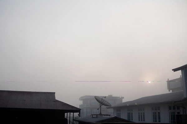
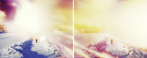
In the ART-Series I took photographs of sculptures and installations in museums and galleries focussing according to my “natural” nearsightedness (without glasses), resulting in pictures of the space between the object and the observer.

Out of the depths of a nearly monochrome photographic surface an object arises but remains out of focus and hardly recognizable. 
Form and colour appear as equal values, they seem to blend and merge instead of signifying each other.
In 1994, still an art historian studying other artists' works, I started photographing sculptures in museums and galleries by focusing according to my natural shortsightedness, without my glasses. This process of taking pictures emphasises the distance between the photographed object and the camera, thus space becoming the prevalent element of the final picture. In the photographs the objects seem to live on in a hermetically sealed space of colour, dematerialised, without any separation of figure and ground. The perception of the photographed three-dimensional art works occurs in a perceptive triangle between (art historical) memory, photographic reference, and signifying difference, in a process that encompasses emergence and disappearance. Released from representation, forms arise as part of a permanent development, and seeing itself becomes an everlasting continuous process.

The ART-Series focuses on the mechanisms of reference and representation instead of on the photographic object. It does not lay claim to objectivity or serve the requirements of documentary. On the contrary, the photographs trace the multifarious aspects of the recipient’s ever-changing perspectives, eventually offering the viewer to locate his position anew in relation to an image, which actually denotes just an undetermined space between certain coordinates. 
In depriving the viewer of an actual rendered object the photographs refer to Lacan's concept of Desire, reflecting basically the fundamental understanding of identity.


all images © philipp lachermann


27.1.11

ANDREAS GURSKY | PHOTOGRAPHY


One of the most 
famous of the 
contemporary art 
photographers is 
Andreas Gursky. 
Gursky was born 
in Leipzig, Germany 
in 1955. 
He makes large-scale 
colour photographs 
distinctive for their 
incisive and critical 
look at the effect of 
capitalism and 
globalisation on 
contemporary life. Gursky studied under Bernd and Hilla Becher at the Düsseldorf 
Kunstakademie in the early 1980s and first adopted a style and method closely 
following the Bechers’ systematic approach to photography, creating small 
black-and-white prints. In the early 1980s, however, he broke from this tradition, 
using colour film and spontaneous observation to make a series of images of 
people at leisure, such as hikers, swimmers and skiers, depicted as tiny 
protagonists in a vast landscape.
Since the 1990s Gursky has concentrated on sites of commerce and tourism, 
making work that draws attention to today’s burgeoning high-tech industry 
and global markets. His imagery ranges from the vast, anonymous 
architecture of modern day hotel lobbies, apartment buildings and 
warehouses to stock exchanges and parliaments in places from as far 
a field as Shanghai, Brasília, Los Angeles and Hong Kong. 
Although his work adopts the scale and composition of historical landscape 
paintings, his photographs are often derived from inauspicious sources: 
a black and white photograph in a newspaper, for example, that is then 
researched at length before the final photograph is shot and often altered 
digitally before printing.
Andreas Gursky has exhibited internationally, including Sydney Biennial 
(2000), 25th São Paolo Biennial (2002) and Shanghai Biennale (2002) 
and Venice Biennale of Architecture (2004). He has had numerous solo 
exhibitions, including Kunstmuseum Wolfsburg (1998), Museum of Modern 
Art, New York; Centro de Arte Reina Sofia, Madrid; Centre Georges Pompidou, 
Paris (all 2001), Haus der Kunst, Munich (2007), Museum fur Moderne Kunst, 
Frankfurt (2008) and Moderna Museet, Stockholm (2009).

 1982 Desk Attendants, Spaeter, Duisburg

 1993 Montparnasse

 1994 Hong Kong Island

 1994 Hong Kong Shanghai Bank

 1995 Centre Georges Pompidou

 1996 Prada

 1998 Bundestag

 2000 EM Arena II

 2000 Shanghai

 2001 Avenue of the Americas

 2002 Copan

 2003 PCF, Paris

 2005 Bahrain I 

 2006 May Day V 

 2007 Kamiokande 

 2008 Untitled XVI 

 2009 Bibliotek 

 2009 Jumeirah Palm

23.1.11

ANALOG | RIFLEMAKER

ANALOG | TRENDS IN SOUND AND PICTUR | RIFLEMAKER


London gallery Riflemaker kicks off 2011 with its annual group show, entitled 
ANALOG - trends in sound and picture, featuring an eclectic quartet of photographer 
Richard Nicholson, sculptor Clare Mitten, rockabilly musicians Kitty, Daisy and Lewis 
and futurist light installation outfit Ziegelbaum + Coelho. The most poignant contributions 
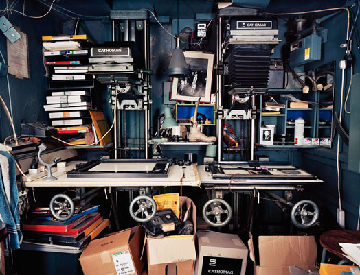
are by Nicholson, who in the summer of 2007 decided to shoot images of professional 
darkrooms in and around London. At the time 204 were still in existence. 
When he completed the project three years later, only eight remained. 
The big companies that grew up servicing the fashion and music industries 
in the 1980s — including Ceta, Keishi Colour, Sky, Joe's Basement, Primary — have all gone.
What remained were the one-man bands, the 'master-printers', which still use film, 
whether printing in black and white or colour. Artisans like Michael Spry
whose high-contrast printing for Anton Corbijn gave U2 and Depeche Mode a 
visual language of their own. Robin Bell whose silver gelatin printing for major 
photographic exhibitions has included everyone from Bill Brandt to Ken Russell,
 Lee Miller to Terence Donovan. And Brian Dowling of BDI, a small commercial 
darkroom on Old Street in East London, who has over the past 32 years printed 
colour photographs for Juergen Teller, Craig McDean and Nick Knight. Knight 
created some of his most iconic and influential work from the late 80s and early 90s, 
including his catalogues for Yohji Yamamoto. The process would take days, with 
Dowling printing conventionally onto a baseboard, masking the various areas with 
sheets of photographic paper, and blending the colours with his hands. Knight is a 
great admirer of Dowling's practice, likening it to Haute Couture.
Initially the images of these craftsmen's dens all look the same, but staring 
into their worlds their uniqueness begins to surface. As Nicholson observes 
"The spaces I discovered were often haphazard and brimming with personal 
details: coffee cups, CD collections, family snaps, unpaid invoices, curious 
knick-knacks brought back by globe-trotting photographers. These human 
elements transformed what might have been a detached typology of modernist 
industrial design into something more intimate and nuanced."
Our world has been changed and enriched by the produce of these black 
cupboards, so how fitting that they too should have been caught on film 
and exposed to a wider audience.
Analog - trends in sound and picture at Riflemaker, London opens on 11 January 
and runs until 31 March.

Text by Julian Balme

 Julian Balme is a London-based art director, 
designer and writer who has had a number 
of photos printed in the darkrooms featured.

Brian Dowling darkroom, Old Street
ANALOG is curated by Tot Taylor 
For hi-res images for publication pls contact Theresa Simon Communications:
7-734-4800 or after hours: 07792-706-494


17.1.11

PEKKA NIITTYVIRTA


Work from Corrupted (and one from Trinity).
I’m interested in the idea of visual “noise” or disruption in your images and was wondering if you could talk a little bit about the role that this noise plays when making an image.
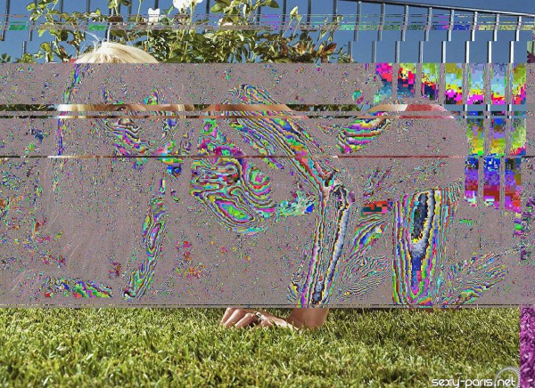
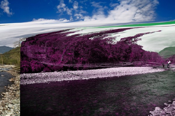
I think that it is important to shed first some light over the technique or method, which is used when creating these images. Images are modified by alteration of digital image file’s source code: inserting or removing data. For example Paris Hilton (Dog Chromosome X, Poodle) has dog’s genetic data and Broken Idyll (Bridge) has phrases from the Burmese propaganda newspaper New Light Of Myanmar inserted to the image file. Image is taken in the Burmese Himalayas. With the picture Removing White, I literally removed all parts of code re-presenting white. Image originally depicted a tank from the World War II.
In a way I destroy the image, but on the other hand, I attempt to create something aesthetically surprising and interesting.
The noise also has the function of distorting or obscuring parts of the original image. For you, how do you choose the images and what choices to you make in altering an image?
I try to choose images which, after manipulation results particular connotation, political or otherwise. Whether I use a image from the web or choose to photograph it by my self, the aesthetics naturally affect also a lot during the process.
The results after insertion of scientific or political data might appear as random, mistakes or destructive to the original re-presentation. But are in fact results of analyzing the image file and careful consideration where to insert the data. There is also some trial and error involved, especially when I first started making these images. Nowadays I have gained quite a lot of control over the effects.
The distorted images also push the photos toward abstraction, and I was wondering if you could talk more broadly about the role of abstraction in your work.
It seems to me that abstraction in photograph is fundamentally different comparing to that of painting. Photograph, as an abstraction may actually be impossibility, since it always tied to its origins in the real world.
I don’t consider these images as abstractions, but rather as information re-ordered in a way, which isn’t quite understandable through conventional methods of reading an image. For me the abstract-looking areas symbolize the visual noise and the identity vacuum of the contemporary society. Images also act as metaphors to the religion like faith in science and technology; Belief of creating something beautiful and good, even if it might not always be the case.” – interview via i heart photograph.

13.1.11

MATTHEW STONE | STAGING REALITY


“Optimism is the Vital Force that Entangles itself 
with and then Shapes the Future.” 
- Matthew Stone 
Matthew Stone is an artist and shaman. These two interconnected roles are defined by his activities as photographer, sculptor, performance artist, curator, writer, Optimist and cultural provocateur. Stone’s work and thinking goes far beyond the remit of his art, and his power of existence is recreating the role of the artist in the 21st century. Recognising this, The Sunday Times recently placed him at number one in the arts section of their “Power players under 30” list.
After Graduating from Camberwell Art School in 2004, with a first-class degree in Painting, Stone spearheaded South London’s !WOWOW! art collective, organizing guerrilla art exhibitions and throwing London’s most notorious and decadent squat parties. Dazed and Confused magazine featured the collective, claiming the children of !WOWOW! “would live on in legend for years to come.” and i-D Magazine described Matthew, saying “He gave birth to a happening, and all of a sudden, in his wake, London was exciting again.”  In 2008 — !WOWOW! took over Tate Britain — attracting a record 4,000 people, who came to witness one of his performances.
Stone’s whole being is geared toward a life lived as art. His personalised definition of Optimism as a method for avant-garde thought and art practice, inverts the nihilistic cultural dialogues of the late twentieth century to create a necessary space for vibrant new ways of being. Saatchi Online said that Stone’s work “definitely points to the art of tomorrow, I think, an immaterial quality equal parts idealist belief and cynicism, working as an alternative, very palpable reality running along the rest of society.” Esteemed curator and ex-head of the Royal Academy; Norman Rosenthal said simply “he has invented a new ‘ism’—Optimism.”
Stone has provided the soundtrack to each of close friend, designer Gareth Pugh’s fashion shows and films, and was a resident DJ at London’s legendary nightclub Boombox.
Though perhaps most known for his painfully beautiful photographic nudes, most exciting is Stone’s recent move into video. He has begun to direct his own video-based artworks as well as a rapturous, celebrated and daring directorial debut in the form of a music video for cult heroes These New Puritans. Following the video’s release, NME instantly placed Matthew at number 14 in their list of the “50 Most Fearless People In Music”.

Churning bodies dissect rhythmic windows that open onto varied states of concentrated being. A collage of  limbs and interconnected consciousness, involving and depicting transcendental states, meditations and ecstatic dance, spin into contemporary motion. The body is shown and used to free the viewer from their own. Stone’s work revolves specifically around creative interactions and community, based on the idea that individual autonomy can be successfully combined with the power of collectivity.
Recent exhibitions and performances have taken place at the Baltic, the Royal Academy, the ICA and Tate Britain.
Biography written by Karley Sciortino.

All images © MATTHEW STONE

See more by Matthew Stone HERE

7.1.11

ISAAC SALAZAR | WORDS


Isaac:
I am someone who has never taken an art class in my life but have stumbled upon making Book Art / Book Origami. I didn't think I had an artistic bone in my body and never thought of myself as creative. I had seen the Readers Digest christmas trees and wondered if it was possible to create a different design or use words.
I first started off doing simple letters, alternating pages for each fold but now I am doing more complex and intricate fonts. I use simple arithmetic and an exacto knife as my supplies along with lots of time. It takes me anywhere from a day for the simpler styles to 2 weeks for the more complex styles. I have recently ventured into logos and symbols and would like to pursue this area more.
My inspiration comes from multiple things and places. I can browse the used book section for titles that stand out to me. For example the recycle symbol was created on a book titled "A World with out Trees".
Every book is still soomewhat readable, unless I mess up, and have to remove a page or two. I mostly fold the pages but yes, I do make some cuts and slices, but the pages are still intact otherwise. I like to take a book that would otherwise end up in a landfill and turn it into art. Rarely do I use new books, unless I am commissioned to. I like to watch Planet Green, and am into alternative energy, recycling and repurposing so it's a good feeling to know my art can contribute to reducing waste.

All images © Isaac Salazar